Color Planes
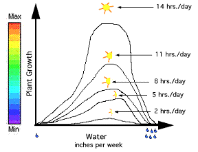
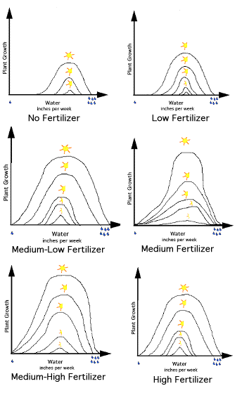
In Figure 2, we have added a color bar to Figure 1. Again, each point on the top line represents the plant's growth rate as a function of inches of water per week with 14 hours of sunlight per day; the next line with 11 hours per day, etc. Now what if we added another independent variable: fertilizer? Let's assume the experiment was repeated. This time six groups of plants were grown with a different amount of fertilizer added to each group. The growth data for each group would produce a graph similar to Figure 2 as shown in Figure 3.
Figure 2-Color bar indicated plant growth equals a color. |
|
|
Figure 3- Six graphs, showing the different plant growth as a result of varying rates in fertilizer application. |
|
Normally, a second independent variable is added on the z-axis creating a 3D Graph. However, if we put the six 2D graphs in Figure 3 together in one 3D graph, it would be a really confusing graph! So let's look at another way to VISUALIZE this data.
In Figure 4, the higher the point is on the y-axis, the greater the growth rate. If a color bar is placed along the y-axis, so that the maximum value of plant growth is equal to red, and the minimum value is equal to purple, then each point of the line can be presented by a color.
| Figure 4- Each point of the top graph is equal to a color. |
|
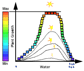
The point at the top of the curve is colored red, since red stands for a maximum value. The point no longer needs to be on a curve for the viewer to know that it is a maximum value. The color takes the place of the y-axis, because the color represents growth rate just as the y-axis did. The curve can then be compressed into a single horizontal line of color. Red represents where the curve used to be at a maximum, and the purple represents where the curve used to be a minimum.
| Figure 5- The color line below the graph represents the plant growth at 14 hours of sun per day. |
|
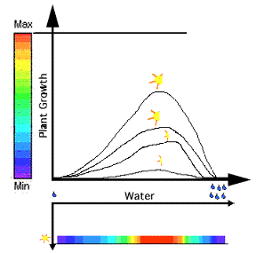
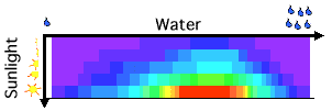
Similarly, color can be substituted for each point on the other four graphs. The five lines of color are then stacked on top of each other in a square. The colors represent plant growth, the x-axis is still the amount of rain per week, but the y-axis is now the amount of sunlight per day.
| Figure 6- The color represents plant growth, with the amount of water on the x-axis and amount of sun on the y-axis. |
|
This movie illustrates the process of creating a color plane.
Click on the icon to download movie (1.66 mb)
![]()
This movie requires Windows Media Player
Constructed solely for this tutorial, the above figures do not represent valid agricultural data.
Copyright © 1998 Central Virginia Governor's School for Science and Technology Lynchburg, VA